The purpose of a book cover is simply this: get a stranger to stop scrolling and lean in. Whatever the intentions, with regard to whether they aim to evoke curiosity or signal genre, or to suggest a mood, appropriate visual choices do all the heavy lifting. The following are tested, doable pointers, which are based on how readers actually read, and will assist any writer or publisher to create a cover that sells. You can also find some advice about when it is smart to design custom book covers and when the use of premade book cover designs is smarter.
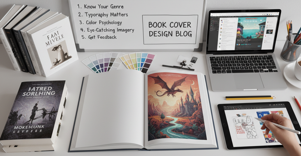
1) Begin With The Visual Language Of Your Genre
Each genre is a shorthand: serif prestige to indicate literary, punchy sans-serifs to indicate business, moody palette and silhouettes to indicate thrillers, and dreamy illustration to indicate romance. Research big sellers in your specific niche and make a list of threads that are shared (Romantic style, fall colors, small subject, texture). You need to make your cover fit well within those and to put one readily memorable twist to it.
2) Develop A Clean Hierarchy (Title > Subtitle > Author)
Readers digest in milliseconds. Let the title be the hero, the subtitle be the clarifier, and the name of the author be the anchor. Aim for:
- Title readable at thumbnail (about 100-160 px high).
- Subtitle is readable, not only on paper but on mobile.
- Same author name through a series to reminisce about the brand.
Pro tip: squint at your design (or zoom in to 10 percent), look how the title blurs away into the background? Raise the contrast or weight.
3) Pick With Purpose (And Use Fewer Fonts)
Normally, two typefaces suffice: one for the title, one for the supporting text. Where you feel you have to add one more, it should perform a definite job (e.g., a smaller, high-contrast serif on a literary subtitle). Avoid contrasting display fonts. Mind spacing:
- Use tight letter spacing in large, conspicuous titles.
- Be generous with spacing between subtitles.
- Look at the widows/orphans; breaks should never be incidental.
4) Establish One Focal Point
A single, striking focal element pulls a reader in faster than a collage. This could be an object (a key, a mask), a figure, or a graphic motif. Use scale (large), contrast (light on dark, or vice versa), and negative space to isolate it. If imagery is busy, soften the background or reduce texture so the title still commands attention.
5) Color That Carries Meaning And Converts
Color sets expectations. Cool blues can signal authority in nonfiction; warm reds and golds evoke drama or romance. Choose one primary hue and one accent; test them in grayscale to ensure adequate contrast for accessibility. Also check harmony: adjacent elements should not vibrate or fatigue the eye.
6) Think Small (Thumbnails) And Think Real (Print)
Your cover inhabits two worlds. Examine a thumb test and export a tiny JPEG and paste it on a retailer mockup that is crowded, is it apparent? Then print a draft and look at the trim size in normal light on regular paper. Print densities of ink, and fine lines and subtle shades, can change in print, and you want to correct that before final files go out.
7) Honor The Back And Spine
At bookstores, the spine greets. Make sure the title is readable at one glance and spine series should have consistent type and spacing. On the back, focus on a close hook, a clear hierarchy and sufficient margin to handle barcodes without congesting your copy. Give breathing space; crammed clutter disperses credibility.
8) File Like A Pro
Technical finishing eliminates production surprises:
- 300 dpi of graphics (higher when fine textures are important).
- CMYK prints as PDF; RGB as ebook covers.
- Include an appropriate bleed (typically 0.125″) and safe zones.
- Embed any font, and export a press-ready PDF (e.g., PDF/X standard where needed).
- Utilize the best stock or original works with clear licenses.
9) Premade Book Cover Designs
Premade book cover designs are best when there is a short time frame or when there is a low budget requirement. What you receive is a professionally crafted concept, which you can then personalize with your title, author name, and often, subtle color adjustments. Select premades by designers who:
- Restrict the quantity of the sales (or provide exclusivity).
- Offer layered files to do simple revisions.
- Be familiar with conventions of your genre.
- Provide prompt positioning of typography.
Should you have a novella, a lead magnet, or a new pen name to try out and start with, then the premade book covers can assist you in making a rapid start without the compromise of quality.
10) Custom Book Cover Design
Go custom when you want brand ownership, a series aesthetic, or visual narrative differentiation (particularly in literary fiction/long fantasy series, or nonfiction). Effective custom book cover design procedure comprises of:
- A concise brief, intended audience, similar books, keywords related to tone, and restrictions.
- Moodboards to settle on direction prior to deep design.
- Iterative drafts were concept-centered and then refinement-centered.
- Prudent art licensing (exclusive graphics or commissioned photography to be truly unique).
The work is custom made but has payoff in the long-term: uniform typography, recurring motifs, common visual grid on rerelease turn out recognizable instantly.
11) Be Wary Of Pitfalls
An overload of fonts or special effects (glows, bevels) that rapidly become dated.
- An excess of literal images that ruin the hook.
- Low-contrast type on textured photos- looks artsy, reads poorly.
- The failure to adhere to retailer guidelines (dimensions, file size, bleed).
- Creating a design that does not reflect against actual store listing.
12) Try It On Your Real Readers
Confusion can be swiftly red-flagged by beta readers or newsletter subscribers. Ask: What genre does this resemble? How do you feel about this? What would you anticipate therein? When the responses fail to reflect what you want them to, change color, type or picture, but not all three, until the message is obvious.
Final Words
The best covers do not attempt to do it all. They pick one promise and render it unambiguous with hierarchy, color and focus. When time and budget is limited, begin by using genre-savvy-designed premade book covers. When creating an author brand over the long term or introducing a lead title, spend on branded book covers which can be scaled across formats and an entire series. Both ways or another, the idea is the same: stop the scroll, induce curiosity and reap the click.